Cabinet colour sets the mood for the whole kitchen. The right shade makes the room feel larger, warmer, or more modern, while the wrong one can clash with countertops, flooring, and lighting. Here is how to choose a colour you will love for years.
Countertops, backsplash, and flooring usually stay in place longer than cabinet paint. Begin by identifying the undertones in those materials. A countertop with warm beige flecks pairs better with cream or warm white cabinets than with a stark cool white. Likewise, a grey quartz with blue undertones suits cooler cabinet colours.
Colour Strategy
White cabinets remain the most popular choice because they reflect light and make kitchens feel open. Warm whites work beautifully with wood floors and brass hardware. Cool whites pair well with grey countertops and chrome or black accents. Off-white and cream soften the look and hide fingerprints better than bright white.
Grey cabinets feel contemporary and sophisticated. Light greys keep the space airy; charcoal adds drama. Greige, the blend of grey and beige, is forgiving because it bridges warm and cool palettes. It works with most countertop colours and both nickel and brass hardware.
Stained wood cabinets bring warmth and texture. Lighter stains like white oak and maple suit Scandinavian or modern farmhouse kitchens. Medium stains such as cherry or walnut feel traditional. Dark stains create contrast but can make small kitchens feel closed unless balanced with light countertops and good lighting.
Navy, forest green, and black cabinets are trending for islands and butler pantries. These colours work best as accents rather than covering every cabinet. A navy island against white perimeter cabinets adds personality without overwhelming the room.
Using one colour for upper cabinets and another for lowers adds depth. Common combinations include white uppers with wood or coloured lowers. Keep the darker or bolder colour on the bottom to ground the space.
Live with samples for several days before committing. Move them around the kitchen at different times to see how light changes the appearance. A colour that looks perfect in the store may feel different against your flooring and walls. Trust the sample that still feels right after a week.

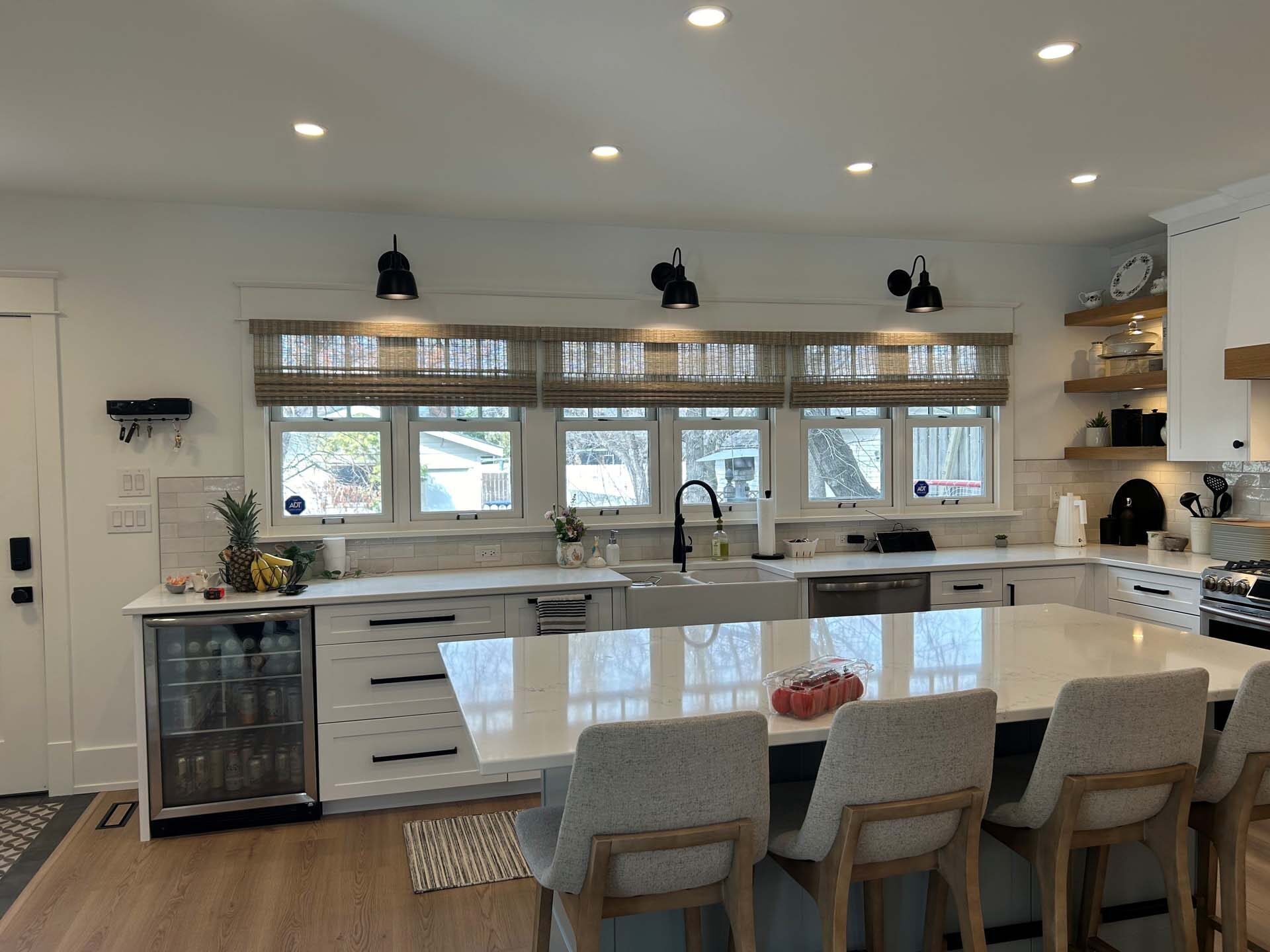
Lighting Changes Everything

Practical Tips
Common Questions
Light colours reflect more light and make walls feel farther apart. White, cream, pale grey, and light wood stains all expand a small kitchen visually. Pair them with minimal hardware and a simple backsplash for the most open feel.
Modern painted finishes with catalyzed conversion varnish clean easily with a soft cloth and mild soap. The bigger issue is scratches and chips, which show more on white than on mid-tone colours. A satin or semi-gloss finish is easier to wipe than matte.
They do not need to match exactly, but they should relate. Carry one element, such as hardware finish, wood tone, or colour temperature, into adjoining rooms so the kitchen feels connected rather than isolated.
Soft white, warm grey, and natural wood stains have the longest staying power. Bold colours and high-contrast palettes can look dated faster. If you want trend-forward colour, use it on elements that are easy to change, like hardware or an accent wall.
Neutral cabinet colours generally appeal to the widest range of buyers. Very personal or dark colours can narrow the buyer pool. If resale is a priority, stick to white, grey, greige, or natural wood tones.
See Cabinet Colours in Person
At Evoke Cabinets, we keep a range of cabinet door samples, finishes, and hardware options on display. Bring your countertop sample, flooring swatch, or inspiration photos and we will help you build a palette that works in your actual space and lighting.
We handle design, fabrication, installation, and follow-up care. Ask us about warranty coverage and lead times during your consultation.
Whether you’re ready to begin or simply gathering ideas, we’d love to hear about your project. Book a consultation and let’s talk about your space.